
If your website isn't making money for you, let's face it, it's 100% worthless to you and your business.
What you've got there is a VERY expensive business card, tucked safely away in the deep dark back corner of your office drawer, making you ZERO DOLLARS.
If your website isn't making money… the problem isn't the pixels, it's the plan.
Let's be perfectly blunt about this for a moment:
Your website looks amazing. It's modern, it's got all the right fonts, color schemes, and the branding is on point.
When you scroll down through the site, suddenly all these great looking animations happen.
You're proud of the design, it's everything you wanted it to be and more…
…except for the ONE THING THAT ACTUALLY MATTERS.
Your Website Doesn't Make Money
No leads, no traffic, no conversations, no conversions.
Just a digital showroom in the middle of nowhere, hanging out doing nothing like an employee on a perma-break sitting out back smoking, or sitting in the staff bathroom death-scrolling on social media.
The truth is, your website is buried. No-one can actually find it, even when they’re actively searching online ready to spend money with you.
What you have here, is a lead balloon.
So, What's Wrong?
It's not your branding, colors, or logo.
Nor is it the platform the website was built on.
It's not your web designer (although it kinda is a little… but I'll explain a little more about this later).
Your Website Strategy is Wrong
You can blame the web designer if you like. The platform they used to design the site, the design never looked right.
Maybe you think you need another redesign, again.
But here's the truth: your website doesn't need another redesign.
It needs a damn strategy.
The Big Lie in Web Design
"A beautiful modern responsive website = a successful business"
WRONG!
As far as myths go in the web design industry, this is the biggest lie ever told.
Most designers get paid to make things pretty, not profitable. If they made something simple that worked, clients would complain it didn’t look flashy enough.
So they go with the animations, the bouncy things, the bells, the whistles.
But, that's drained more wallets than Ponzi schemes, MLMs, and Vegas slot machines combined.
The fact remains, this myth has drained more wallets than Ponzi-schemes, MLM's, and Las Vegas slot machines combined.
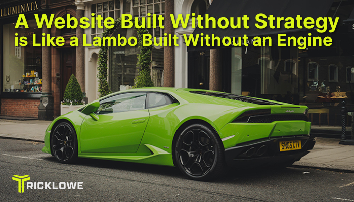
A Sick Website Design Without Strategy, is like a Supercar without an Engine
No doubt about it. Ferrari's and Lambo's really are some pretty sick cars.
They look amazing, sleek, modern, completely different to anything else out there. They have curb appeal, make you look great, and who wouldn't want to drive something like that?
But, what if the car didn't actually have an engine?
Good luck getting to work in THAT pile of junk!
Whilst there aren't too many cars being sold these days without engines… I DO see websites without strategy every single day, time and time again.
This is especially true with ambitious entrepreneurs, coaches, and service providers trying to create freedom businesses.
They spend $5K, $10K, and even up to $20K into the sexiest looking, smooth, unique looking website… but completely missed the MOST IMPORTANT PART.
The part where the website needs to be designed as a business, and actually designed TO SELL.
What Websites without Strategy Look Like
Your website might not have a strategy, if any of these things are true…
- The homepage looks like a mood board
- Your services are buried three clicks away, under something vague like a 'contact me' or 'work with me' page
- The call-to-action is a 'Contact Me' link (AKA a 'ghost me' link)
- Your site is just set up for you to look good, not to drive sales or conversions
I get it. Everyone says you need your site to look good / look pretty. But nobody's telling you that pretty doesn't pay.
A pretty website without:
- Any real purpose to exist
- A result to produce
- Good structure and a direction to take people in when they get there
- Strategy of where the customer journey starts, or where that journey ends
Is just a really expensive digital paperweight, door stop, piece office furniture you never use, or a car that you can't drive anywhere.
Let Me Show You Strategies That Do Work
Here's where shit gets real for a second.
At SharedGraphics.com, I don't just design kick-ass, beautifully designed, easy to use websites that work on everything perfectly (which, by-the-way, I do an amazing job on!).
I build high-converting brand platforms.
Websites that actually SELL.
That turn visitors into clients, customers, raving fans, and (just as importantly) income for you.
I do it with a couple of really simple frameworks.

Framework 1: The Hero Framework
I hate to inform you, but you're not the hero in this story…
Story: Make Your Audience the Hero
Most websites make the mistake of talking about you.
What you do.
What you've done.
Where you've been.
Your journey.
The vision YOU have
Your dream.
How qualified YOU are.
I'm gonna let you into a really big secret here…
NEWSFLASH: Nobody Cares (about you and your story)
Nobody's on your website to hear your story. They're here for themselves.
So, I flip the script.
I make the visitor (your future customer), the hero of the story.
Then, I position you as the guide who's going to help out of their situation, and win.
This means I've gotta:
- Call out their current plan
- Speak to their deepest desire
- Show them the way out
Instead of saying, "I help businesses grow." You should be saying, "Ready to stop guessing and start getting clients from your site?"
Meet them in their chaos, point out their pain, and offer them a clear way forward.
Show them your product is the best possible solution to their problem.
Framework 2: Problem, Process, Product
This framework is super simple, and can even be used in short form social media posts, and be extremely effective.
It's real simple, you start with the pain…
Pain / Problem
Name the pain / problem. Call it out like the zit on your face.
Make your potential customer feel that pain for a second. Identify that pain so it's real, right in front of us right now, on the table, ready to discuss.
Process
Real simple, I'm going to walk that client through the process of fixing their problem.
Maybe this is through a few steps, or an on-boarding process, or design / quote needs to be done (ugly kitchens aren't fixed without a beautiful design and a budget to work with).
Break down the steps of fixing the problem, make it sound simple, easy, and something you've done a million times.
Product / Solution
Next, you present your product as the solution to the problem, or show them the way forward.
The solution to an ugly kitchen is to book a design consultation, so the designer can work with the budget you have, on the kitchen of your dreams.
Show them the door to the solution…
…and make sure it's an offer SO GOOD, they'd feel stupid saying no.
The website structure is ALSO super important….
Structure: Guide Them Like a Sales Page, Not a Brochure
Most websites are built like brochures.
They give you information with no instruction. Then, they sit back and wait for your customer to pull-the-trigger, or to go do more research, or to figure it all out for themselves.
As a sales professional for over 20 years, I can tell you humans don't work that way.
We need to be guided, step-by-step.
Some hand-holding and guidance simply has to happen.
If it doesn't, we wonder off the lot and buy another car from the guy that wasn't afraid to ask for the business right now.
I structure every page like a high converting sales page.
- Big, bold promise up top
- Proof + authority next
- Social proof and credibility
- Objections handled proactively
- Clear, specific offer
- Urgent, clear, irresistible CTA
This isn't about being pushy, it's about persuasion.
You've gotta be 100% clear about what the page is doing, and how.
You must know what your customer's problem is, show them how YOUR PRODUCT solves it, and they need to know how to buy it with an irresistible offer they'd feel stupid saying no to.
If someone lands on your website and doesn't know what to do in 5 seconds or less. you've already lost them.
Call to Action: One Page, One Purpose
Most websites try to do WAY too much.
They say 'Let’s book a call!', 'Subscribe to my email list!', 'Check out my services!' AND 'Follow me on 12 social media platforms!'
All that achieves is: paralysis.
Your ideal customer just walked into your store… doesn't know where to go, what to do, or what to click on. They still don't have the info they came here for, or where to find it.
to solve that problem, know that every page on your website has to have just ONE GOAL.
If it's your homepage, it needs to be like a menu, or a sign post that takes them to your most important offer.
Your services page might need to book a sales call, or get them on the phone for a quote.
If it's a lead magnet page, then the only thing it should do is GET THE DAMN OPT-IN. THAT'S IT!
Think sniper, not shotgun.
Before and After: A Website That Converts
All of that = paralysis.
Every page on your site should have ONE goal.
If it’s your homepage, maybe it drives them to your signature offer.If it’s your services page, maybe it books the sales call.If it’s a lead magnet page, then the goal is the damn opt-in. That’s it.
Think sniper, not shotgun.
Before & After Shared Graphics
Before:
- Looks 'professional'. So cute, it's actually adorable.
- Confusing structure
- Vague messaging like 'let your future vision be a reality' (what are you fixing, eyeballs?)
- Low engagement, because copy isn't enticing or persuasive
- Crickets in your inbox
After (with a real strategy):
- Makes a clear promise
- Guides the user like a story
- Builds authority fast
- Anticipates objections, and handles them
- Converts website visits into action
See the difference?
One looks good. The other performs.
The Truth About Your Website
If your site isn't converting, or selling anything…
- It’s not a tech issue.
- You don't have a design issue
- It’s a strategic issue
And, you’re not even close to being alone—this is 95% of the internet.
The web is full of 'cute', 'pretty', powerless websites.
You don’t need another redesign. What you need is a strategic rebuild.
Your website needs to be designed for:
- Clarity
- Confidence
- Conversion
You need a web designer who didn’t just go to college to 'do web design' as a career. You need a designer that's experienced in building businesses, and high-ticket client magnets.
This Is Exactly What I Do at SharedGraphics.com
At Shared Graphics, I don’t start with design.
I start with the purpose, and the mission.
- What do you want your website to do for you?
- Who are you here to serve?
- What transformation do you create?
- What story does your brand need to tell?
- How should your offers flow?
- How will people find you?
- What’s the journey from 'I just found you', to 'hell yes, I’m in!'?
Once I have a complete understanding of the above…
...then (and only then), is when I design and build.
What You Get with a Shared Graphics Website
What you get is not 'just a website.'
You get a revenue-generating platform that does the hard work for you.
Whether you’re a:
- Local business not getting any calls or bookings through your website
- Coach tired of an empty calendar, and ghosted video calls
- A Brandividual hearing nothing but crickets in your inbox
- An influencer without any real influence or email list
I build the platform that backs up your hard work, and ultimately helps bring in the revenue.
Because, lets face it, if your website doesn't bring you any money... what the hell is the point in even having one?
Let's Go!
This isn’t about bells and whistles.
This is about clarity, strategy, and precision.
It’s how independent operators build empires online, get their freedom back, and own the business they started out building.
Which of course, beats the shit out of checking metrics all day, wondering where all the people went in your niche.
If you're interested in finding out more about how to make improvements to your current website, need a new website designed, or want logo / branding work, check out my web design & branding website, head over to SharedGraphics.com, and shoot me an enquiry.
We can schedule a strategy call so I can learn more about your business, what's important to you, and what you want your website to do for you.
It's completely free, and even if you don't decide to work with me, I can usually offer some practical advice and help so you can improve your online presence.
If you haven't already, sign up for my weekly newsletter, The Lowe Down. It's a regular Saturday morning email packed with proven conversion tips, and the playbook you need to double your business growth.
Newsletter Sign up: subscribepage.io/qRyJtU
Until next week…
Tricklowe