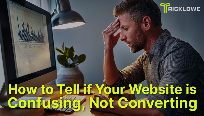
What percentage of your website visitors are actually converting into business?
When it comes to their website and marketing strategies, most founders and brandividuals either think they have a traffic problem, or a content problem on social media, not attracting enough people.
Only, usually it’s neither the traffic, nor the content they’re putting out to attract customers.
Most of the time they have a problem with clarity.
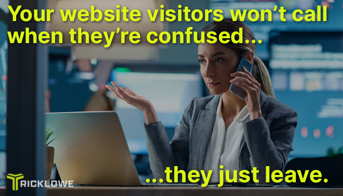
The problem with identifying this problem, is your website visitors don’t call you or email you to complain when your website confuses them.
They just leave.
And then, they buy somewhere else.
Confusion is Murdering Your Website's Sales
Confusion is the silent killer of conversion.
I’m going to show you exactly how to spot this problem.
Then, I’ll show you what to do about it...
5 Red Flags on a Confusing Website
Let’s take a look at the most common things I see that end up with people bouncing off your website and going somewhere else… even if it looks amazing.
1. You Website is Asking for Too Much, Too Soon
If you look at your home page, and the first thing it does is bombard people with:
- Book a call
- Sign up for a newsletter
- Follow me on Instagram
- Download my free guide
...you’re already toast. You’ve lost them.
Website Visitors Need a Clear, Single Action to Take
Every extra option adds a distraction, and friction. Friction kills conversion.
If people are given choices they either don’t know what to do, can’t decide, won’t decide, choose the wrong thing, or even worse, do nothing at all. This won't lead to a visitor converting into a lead for you.
Don’t give people a selection of options, give them one.
When it comes to advice, people like being told what to do.
You’re the expert, be the guide.
Your website MUST work like a funnel, with an easy to follow, direct path.
Not a pinball machine, bouncing them around from here to Timbuktu.
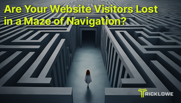
2. Your Website Navigation Is a Maze, Not Amazing
Ever been to a website where you just can’t figure out how to do, what you want to do?
15 minutes later you’re frustrated beyond belief. Eventually you find the link to the correct page buried somewhere deep down in the footer.
Or maybe you had to go through a maze of pages, forms, or content to get there.
If your menu has:
- Dropdowns within dropdowns (within dropdowns)
- If there are 8+ items in your header navigation
- Links in the footer no one has clicked since 2017
- Pages with conversion tables or guides for things nobody wants, or asks for
You’re creating confusion, not converting customers.
People Don’t Want to Dig Through Your Website
Don’t make people come over dig through your back yard for the buried treasure. This is not an escape room, or a singles bar, either.
Your prospects and customers want to:
- Know what you offer
- See proof that it works
- Take the next step
Your navigation should reflect that. Less is more.
Make it clean, simple, and linear. Give people a clean, direct path through the buying process.
3. Mixed Messaging in Your Sales Copy
If your website’s message isn’t clear to everyone, it’s clear to no one.
Are you selling freedom and solving problems, or selling funnels and confusing people?
Are you leading with transformation or tech specs?
Confusing messaging happens when you:
- Try to appeal to everyone
- Talk about features (what the product does) instead of outcomes (what problem the product solves, and the results it gives your customer)
- Use industry jargon instead of human language
Website copy with clarity means saying exactly what you do, exactly who it’s meant for, and why the hell it matters…
…IN PLAIN ENGLISH.
Your Copy Get’s Too Complicated
You’re not writing a novel, thesis, dissertation, new book for the Bible, or a 127 page instruction manual.
It’s not rocket science, or a college application letter.
You’re not trying to prove how smart you are, you’re trying to persuade someone to buy now.
It’s as simple as: ‘1, 2, 3, - this is what it does for you, and this is how you buy it’.
4. Zero Visual Hierarchy
Visual hierarchy is what tells your visitor where to look first, then second, then what to read next, etc.
If your site has:
- 10 different font sizes
- Buttons that blend in without contrast
- Walls of text with no breaks
- Bold headlines stacked on bold graphics…
…then nothing stands out.
And… if nothing stands out, nothing gets clicked.
A confusing design leads to decision fatigue. If they can't decide, they get tired, and walk away from the deal, and are definitely not converting into a customer for you.
If Everything’s Bold, Nothing’s Bold.
Your prospects and customers should be able to scan through your web pages quickly, and only stop when they want to, to take in points that are valuable TO THEM.
A clear layout means easy and fast understanding, and your buyer taking action.
5. No Clear Call-to-Action (or Worse… Too Many)
This is HUGE. It’s so massively important, and SO MANY get this wrong.
As I said earlier…
…people like being told what to do.
Don’t believe me? Try this example...
Don’t Think You Like Being Told What to Do?
You visit a financial advisor hoping for advice and guidance on what you should do with your $4million inheritance.
They say you have 10 options available, They’re not sure what you should do, so they show you the options, and ask you what you want to do with your money.
Aren’t they supposed to be the financial experts?
A good financial advisor shows you the options, tells you what they recommend, and why that’s the best course of action to take.
Your Customers are Begging to be Told What to Do
If a visitor lands on your homepage and doesn’t know what to click next, you’ve failed.
A good Call to Action should:
- Be singular (one CTA per scroll section)
- Be framed around action ("Get the Plan" vs. "Submit")
- Be visible — not hidden at the bottom of the page in 10pt gray font
Remember: website visitors don’t read… they scan.
Give them a big, bold action step they can take without thinking.
How to Self-Test Your Website
You don’t need a full audit to catch the most common clarity killers.
Here are 3 simple tests you can do right now:
The Stranger Test
Send your homepage to a friend who knows nothing about your business.
Ask them these questions:
- What do you think this brand does?
- Who is it for?
- What would you do next if you wanted to buy?
If they get it wrong, or don’t understand you definitely have a problem with clarity.
The 7-Second Rule Website Test
7 seconds might well be a little longer than you'd like to admit picking up food off the floor. But, it's just long enough for people to give up on you. on your website.
Here's how you figure out if that's a problem for your business. Remember to do this test as if you've never seen your website before.
Set a timer for 7 seconds. Then, pull up the home page of your website and start the timer.
When the timer ends, ask yourself:
- Can I tell what this site is about?
- Do I know what the business offers?
- Is there one clear action to take?
If not? You’re leaking trust, attention, and leads. This means your business is leaking money like a bucket full of buckshot holes, by not converting visitors into dollars.
The Mobile Audit
In June 2025, mobile devices account for a substantial majority of internet usage globally, with 63.3% of web traffic coming from mobile phones, according to Statcounter.
Visit your site on your smart phone right now.
Actually scroll through it.
As you do, ask yourself honestly:
- Is the text readable?
- Are buttons tappable without zooming?
- Does the CTA stand out or get buried?
The mobile user experience is more than half your battle. Don’t ignore it.
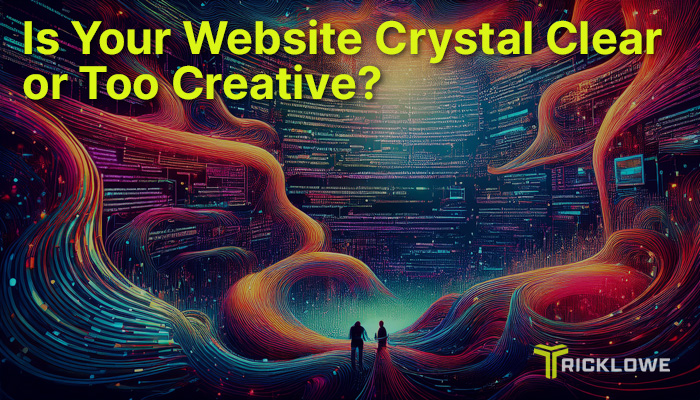
The Fix: Clarity Before Creativity
Creativity is great, once you’ve nailed clarity. But, most web designers try to be clever, instead of clear.
Here’s how to start fixing that:
1. Simplify Your Messaging
- Lead with outcomes, not features
- Say what you do like you’d explain it to a 10-year-old
- Avoid buzzwords and vague claims ("scale your impact")
2. Streamline Your Layout
- One Call to Action per section
- Consistent font sizes and button styles
- Use white space like a weapon
3. Use Visual Anchors
- Headline first, then a sub-headline, then a call-to-action. This is the smart flow.
- Icons, arrows, and contrast can guide the eye
4. Remove What Doesn’t Serve
If something doesn’t drive clarity, it's not converting, so kill it.
That image carousel? Gone.
That third-tier menu link? Delete.
That extra paragraph that says the same thing? Cut it.
Ready for Brutal Clarity?
If you’re second-guessing your site, your visitors already did, and left.
This is exactly why I created Roast & Rescue:
- First, we have a 30-minute Tricklowe Clarity Call where we dissect your site live
- Then, I send you my custom Pixel Report PDF that shows you what’s broken, and how to fix it
You’ll walk away with sharp direction, clear fixes, and real strategy from an expert on the topic.
This is the same exact thing I do for corporations and larger businesses when their websites and landing pages aren't converting, that I usually charge $2,499.00 for.
For you, as a founder-based business, or a bandividual in need of some clarity, It’s just $247.00.
If you ever decide to work with me on your website in the future, the $247.00 isn't lost, it gets rolled into that project as a discount.
It’s brutal, and it's honest, but it works.